SwiftSettle — Mobile-First Dashboard Redesign
Transforming SwiftSettle's file management from desktop-centric to mobile-optimized for real estate professionals working across multiple locations.
Overview
This work was completed at RamQuest before the company sold its ready2close product to Qualia in February 2025. The designs were production-ready but not launched due to the acquisition. SwiftSettle is used as the product name throughout this case study for confidentiality reasons.
Company: RamQuest | Role: Product Designer | Team: Product Owner, Engineering Team | Tools: Figma, FigJam | Timeline: 4 weeks
The Challenge
“When real estate professionals work from properties, cars, and closings, mobile can’t be an afterthought.”
SwiftSettle worked on mobile browsers — but it wasn’t designed for them. Real estate professionals were pinch-zooming through critical workflows while standing in driveways and sitting at closings.
From Desktop-Only to Mobile-First: A Complete Transformation


The Problem: Built for Desks, Failing in the Field
Minimal visual hierarchy and no context. The interface lacked professional polish and clear status indicators, making it difficult to quickly understand transaction status.

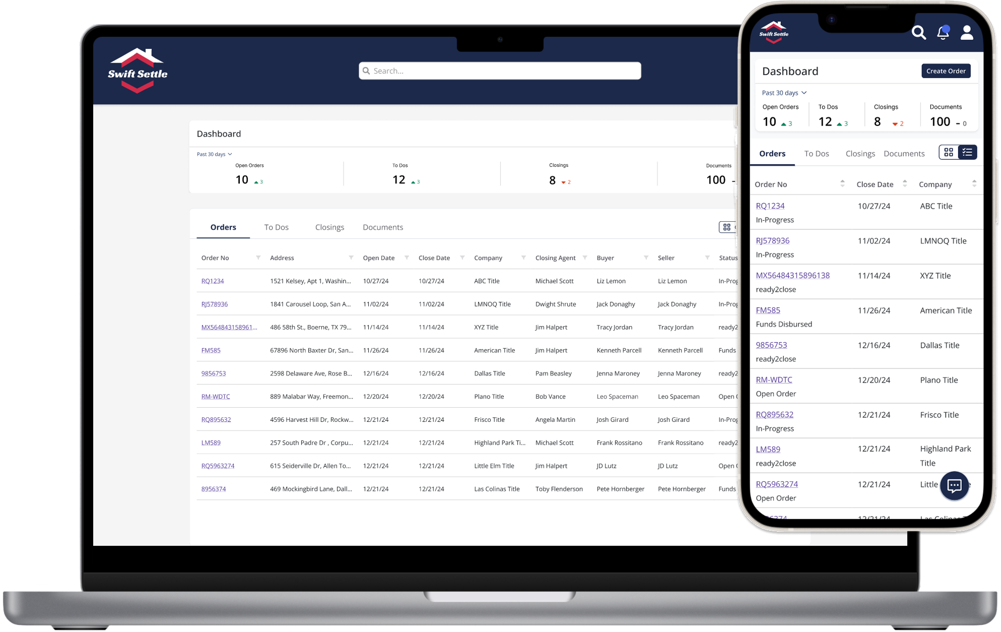
Desktop interface crammed into mobile viewport. Agents needed to pinch-zoom and scroll horizontally just to read property addresses.

Design Process
“Starting with mobile constraints forced clarity and hierarchy that improved the experience across all devices.”
1. Research & Analysis
Analyzed user interviews and performed competitive analysis of mobile solutions.
2. Mobile-First Design
Started with 375px viewport. Collaborated with product owner to determine essential columns for mobile, iterating together to balance information density with usability.
3. Progressive Enhancement
Scaled up to tablet and desktop, adding density without sacrificing mobile clarity.
4. Validate & Refine
Tested with stakeholders, refined toggle system, and polished interactions.
The Solution
Mobile-First Design That Works Where Real Estate Happens
Dashboard with Metrics
Instant workload visibility with summary metrics. Touch-optimized interface with clear visual hierarchy and one-thumb navigation.

Card View with Toggle
User-controlled density. Toggle between professional grid view and visual cards — protecting users from poor-quality property images while offering choice.


Order Details
Every element designed for real-world use: large tap targets, glanceable status indicators, and platform-appropriate navigation.